3.3 Main window

Overview

The content of the main window changes when a other navigation (module) button is activated, but the main parts are the same for all modules.
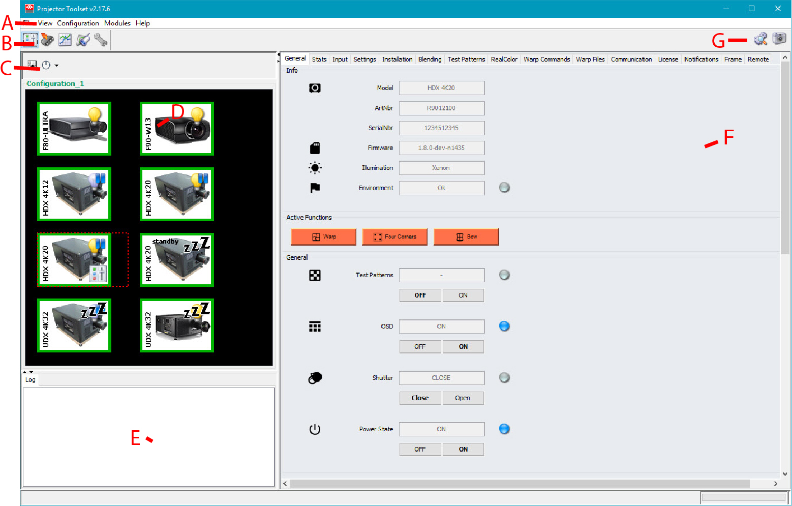
Image 3–2 Main window indications
IndicationDescription
AWindow title. Construction of active module - Configuration name
BMenu
CModule navigation buttons
DConfiguration preview pane
ELog window. Can be hidden by the log information button on top of the configuration preview pane.
FSettings pane. Content changes with the selected module button and selected projector/device.
GManage buttons for configurations and snapshots
Tool tip

Some items and or icons show a tool tip when moving the cursor over that item or icon. This tool tip helps to identify the buttons or items.

Scroll bars

If there is more information available than displayed in a pane, vertical and horizontal scroll bars will be added to that specific pane. These scroll bars let you move up and down and left and right through the information in the pane. Vertical scroll bars are the bars on the right side of the pane. Horizontal scroll bars are the bars at the bottom of the pane.

To use scroll bars, place the cursor on the scroll box, click and hold down the mouse button. Move the scroll box the entire span of the scroll bar. Notice how you can move and up down in the information in the pane.

You can also click anywhere above or below (left or right) the scroll box in the empty space. Click once with the mouse and the scroll bar will make larger leaps in the information.

Split bar

The split bar divides the different panes. The position of the split bar is adjustable.

Image 3–3 Split bar

To adjust the position, place the cursor over the split bar separating the panes, so that the two-headed arrow cursor appears. Click on the two-headed arrow and drag it until the panes are the desired size.