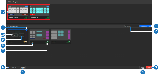
Click Open (reference 10) on the desired widget or template.
Tip: The Open (reference 10) button appears when hovering over the widget.
Image 8–177
1
New widget button
2
Resolution filter drop down
3
Delete selected widget
4
Cancel selection
5
Duplicate selected widget
6
Deselect button
7
Widget name label
8
Widget resolution label
9
Copy link to widget button
10
Open selected widget button
11
Widget selection check box
12
Widget templates
The widget detail page is shown.
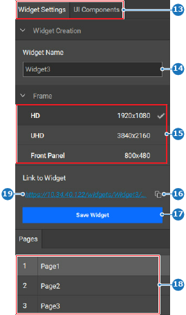
Click on the desired page (reference 20) in the bottom bar.
Image 8–178
20
Page button
Must a label or function be added to the widget?
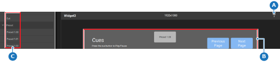
In case of a label, drag the T (reference A) from the central work area and drop (reference B) it in the widget window in the central work area.
In case of a function, drag the desired function (reference C) from the left panel and drop (reference B) it in the widget window in the central work area.
Image 8–179
A
Drag label position
B
Drop area
C
Drag function position
Adjust the position of the dropped element using one or both of the following methods:
Drag and drop the label or function in the desired location (reference B, Image 8–179) within the widget.
Modify the elements absolute H Position and V Position with the right panel using one of the following methods:
Using the slider (reference 25): drag the white ball over the slider until the desired amount is reached.
Entering a value (reference 26): enter any desired value in the input field.
Using the + and - buttons: click on the + (reference 22) to increase the value with one point and on the - (reference 24) to decrease the value with one point.
Note: Widget elements are not allowed to overlap.
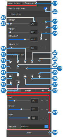
Image 8–180
13
Category selection
21
Button corner rounding toggle
22
Increase widget element button
23
Link widget element aspect ratio button
24
Decrease widget element button
25
Widget element slider
26
Widget element input field
27
Top align selection
28
Horizontal middle align selection
29
Horizontal distribute selection
30
Vertical distribute selection
31
Bottom align selection
32
Left align selection
33
Vertical middle align selection
34
Right align selection
35
Align selection with the center of the widget window
36
Align selection with the vertical center of the widget window
37
Align selection with the horizontal center of the widget window
38
Align selection with the right widget window border
39
Align selection with the bottom widget window border
40
Align selection with the left widget window border
41
Align selection with the top widget window border
42
Widget element appearance category selection
43
Widget element appearance options
44
Delete button
Change the size of the element using one or both of the following methods:
Drag the edge of the element within the widget.
Modify the elements absolute H Size and V Size with the right panel using one of the following methods:
Using the slider (reference 25, Image 8–180): drag the white ball over the slider until the desired amount is reached.
Entering a value (reference 26, Image 8–180): enter any desired value in the input field.
Using the + and - buttons: click on the + (reference 22, Image 8–180) to increase the value with one point and on the - (reference 24, Image 8–180) to decrease the value with one point.
Tip: The link icon () ensures the aspect ratio of the element remains the same.
The unlink icon () means the aspect ratio can change.
Modify the appearance of the element using the following settings:
Button round corner toggle (reference 21, Image 8–180), only available for function elements.
Color menu (reference 42, Image 8–180), only available for function elements.
Border menu (reference 42, Image 8–180), only available for function elements.
Text menu (reference 42, Image 8–180), available for all elements.
Must the position be aligned to other widgets or the widget window?
If yes and with other widgets, select all relevant widgets in the central work area and click the desired alignment in the right panel (reference 27 through 34, Image 8–180).
If yes and with the widget window, click the desired alignment in the right panel (reference 35 through 41, Image 8–180).
If no, go to next step.
Tip: Hold CTRL or ⌘ to select multiple entries at once. If this does not work, enable the keyboard shortcuts in the settings. For more information, see “Keyboard shortcuts”.
Note: Some options are only available when three or more layers are selected.





 ) ensures the aspect ratio of the element remains the same.
 ) means the aspect ratio can change.